Background project: research & layout
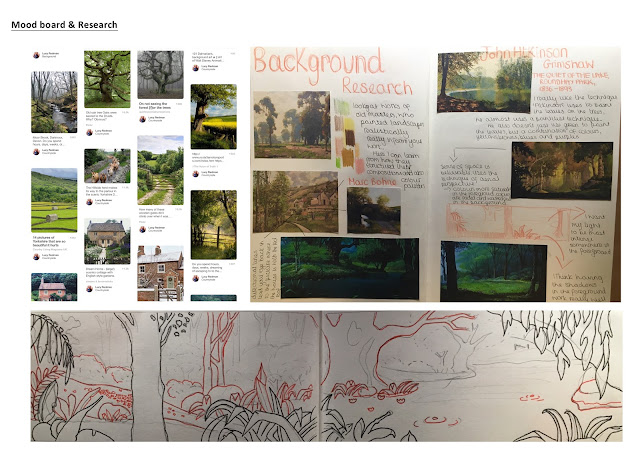
I started my project off by creating a Pinterest mood board, here I gathered primary sources of what the countryside looks like, studying closely the forms of trees, brushes, hills and fences. After doing a few drawings of these in my sketch book, recording what I see and not what I think I see, I started to look into stylising these forms. I turned to the great masters for inspiration looking closely at their choices of: composition, style and colour palette.
Marc Bohne's work particularly interested me as I noticed that in several of his landscapes he positions trees right up close in the foreground. The branches of the tree frame the scene and is very inviting to look at. It also gives the painting a real sense of depth as a definite foreground and background is established. This technique is something that I will apply when drawing my template.
I also looked at the work of John Atkinson Grimshaw, for his painting techniques. To paint foliage and the leaves on the trees, he simply uses dots of paint layered up upon each other which imitates the pointillist's methods. He also doesn't just use green to paint the leaves, but a combination of colours, yellows, blues and purples. His painting style works so well, it is something I want to imitate for my final background.


Comments
Post a Comment